Android 12 was released on October 2021. Normally a new version of Android means new features, and in the past those new features have been improvements. This isn’t really the case with here.
You can summarize the Android 12 release with a single new feature: “Extra Dim”.
Extra Dim, also known as: I upgraded to Android 12 and all I got was this lousy, bright gray dark theme.
Android 12
I think Android is great, don’t get me wrong. But Android 12 is nothing special. I like the new privacy improvements for notifying about camera and microphone access, but that’s about it.
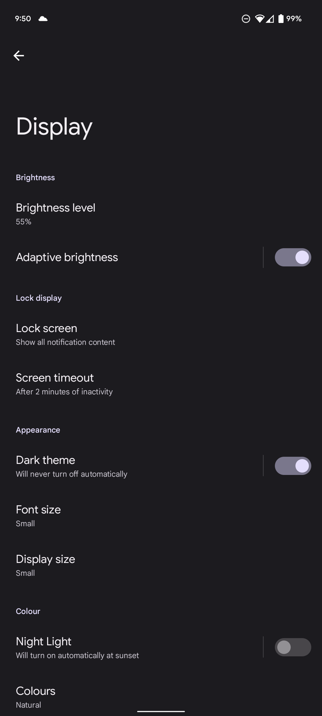
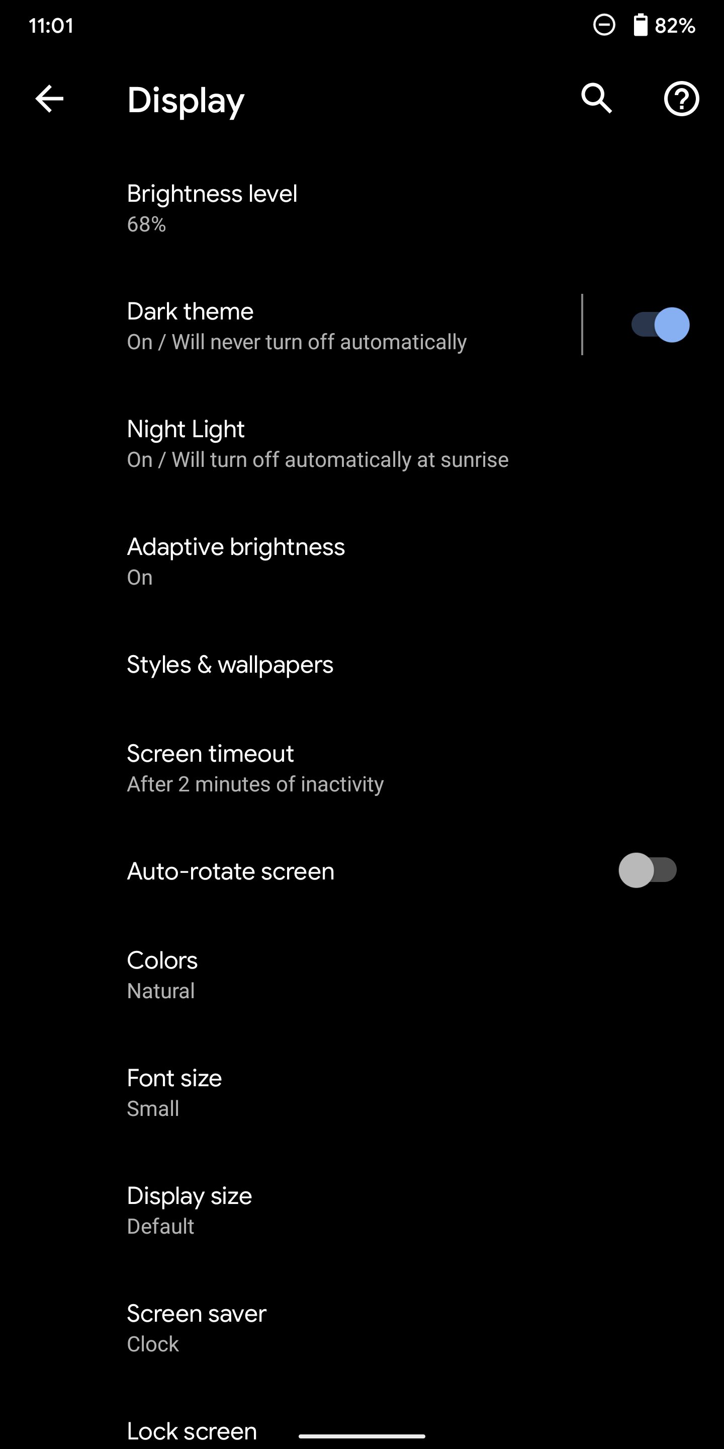
Extra Bright Dark Theme
Why? Just why would you make the dark theme so bright? I mean you can light up a dark room with this thing. I don’t care if the screen doesn’t look quite as good with black AMOLED. Don’t take away the proper dark theme and give us this bright gray dark theme. Then, on top of that we get a button called “Extra Dim”. Just why.
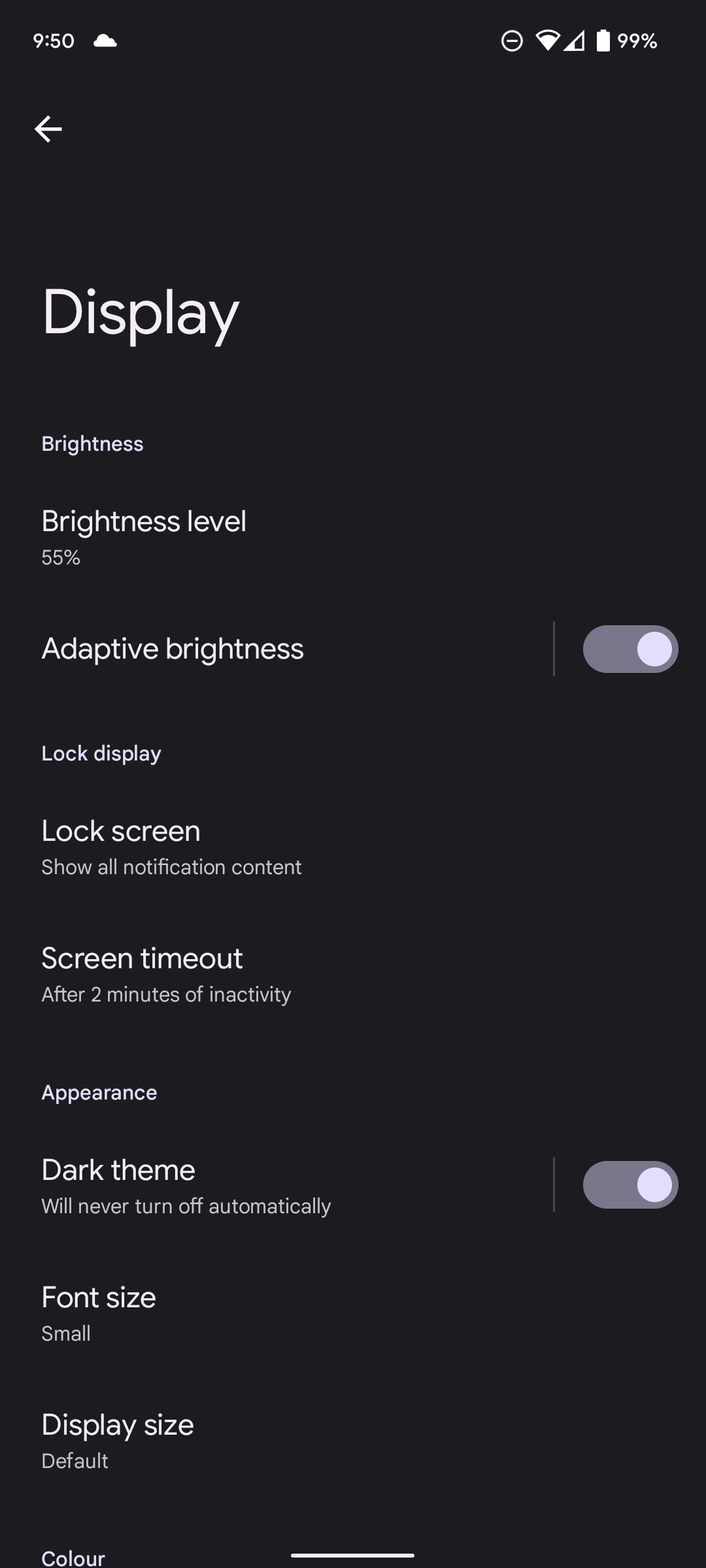
Extra Dim
Why do I need a button to activate “Extra Dim” screen brightness. Why can’t I just adjust the brightness slider for lower brightness. Now the user interface has two different places for screen brightness. I understand it’s under the Accessibility menu, but Android 11 did not need this. Android 11 was actually darker at it’s minimum brightness with the Dark Theme enabled than Android 12.
Adaptive Brightness is slow
Adaptive Brightness on Android 12 is slow compared to Android 11 (Pixel 6 vs Pixel 2XL). It takes way too long for Android 12 to figure out it should change the screen brightness in my opinion. And often it just seems to get it wrong. Android 11 never had this problem.
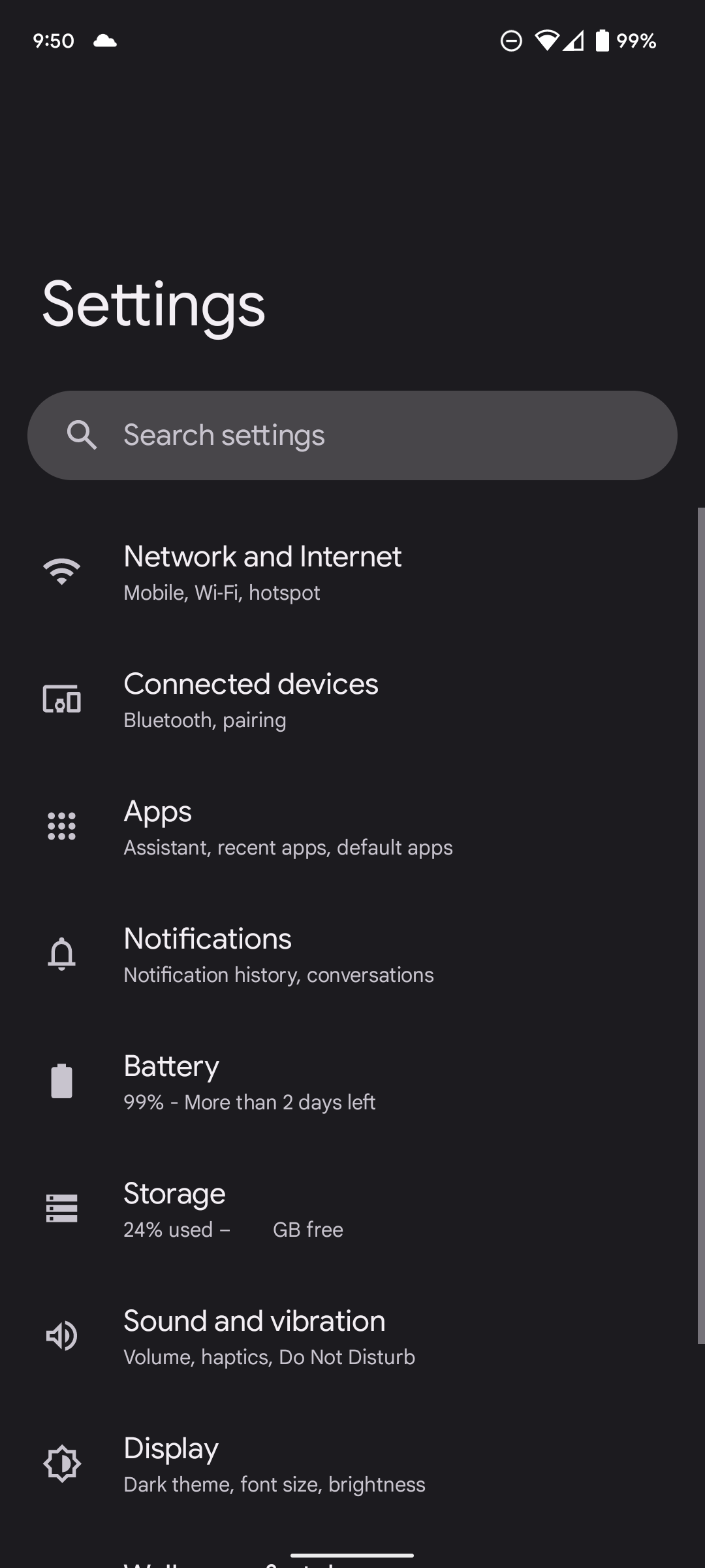
Larger Buttons and Space around everything
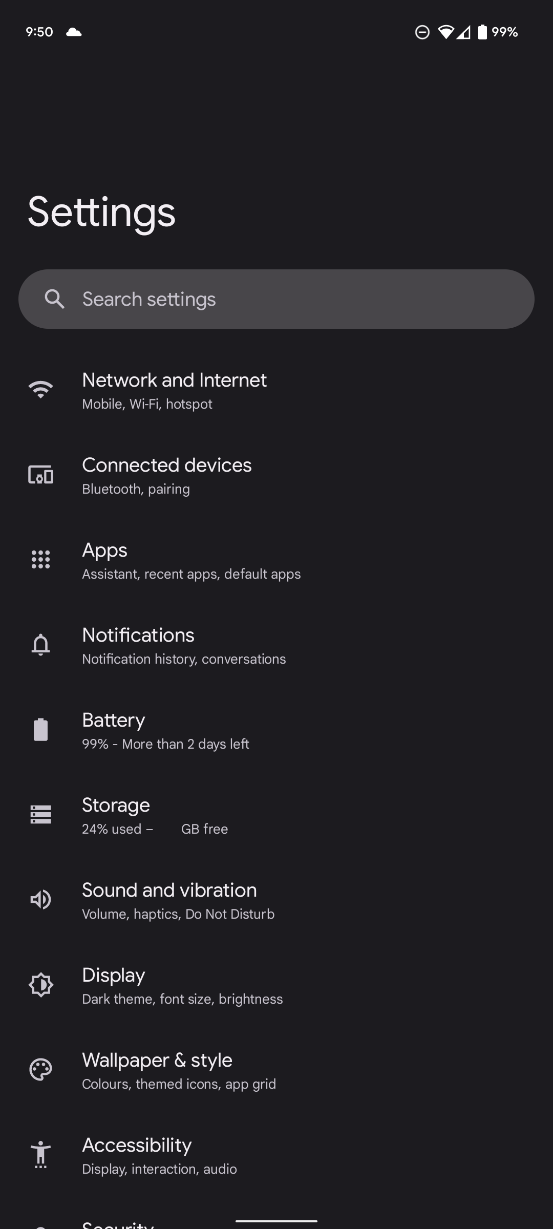
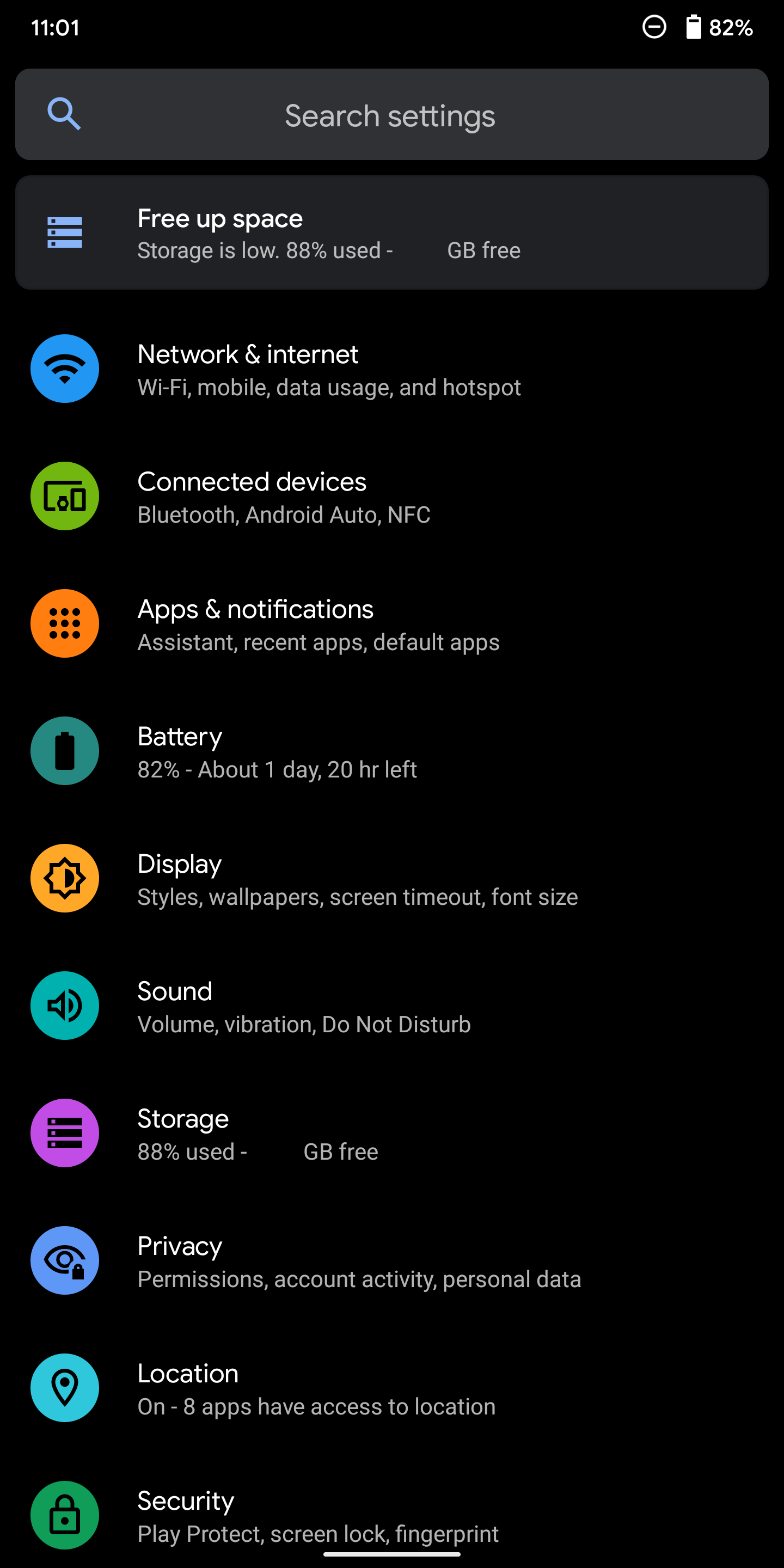
Why do I need such large buttons? I change my phone font to be small and even with the “Display size” set to small there is so much wasted space around everything. Just open up the Settings and you can see how much wasted space is at the top of the screen. I don’t really want a small “Display size”, I just want less space around everything!
Those buttons, just wow. And at night even with the lowest brightness, they are still so bright!
Theme Colour from Wallpaper
Maybe some people want the main colour for the theme to be picked automatically from the wallpaper. Or maybe some people only want to pick from 4 “Basic colours” for use by the theme.
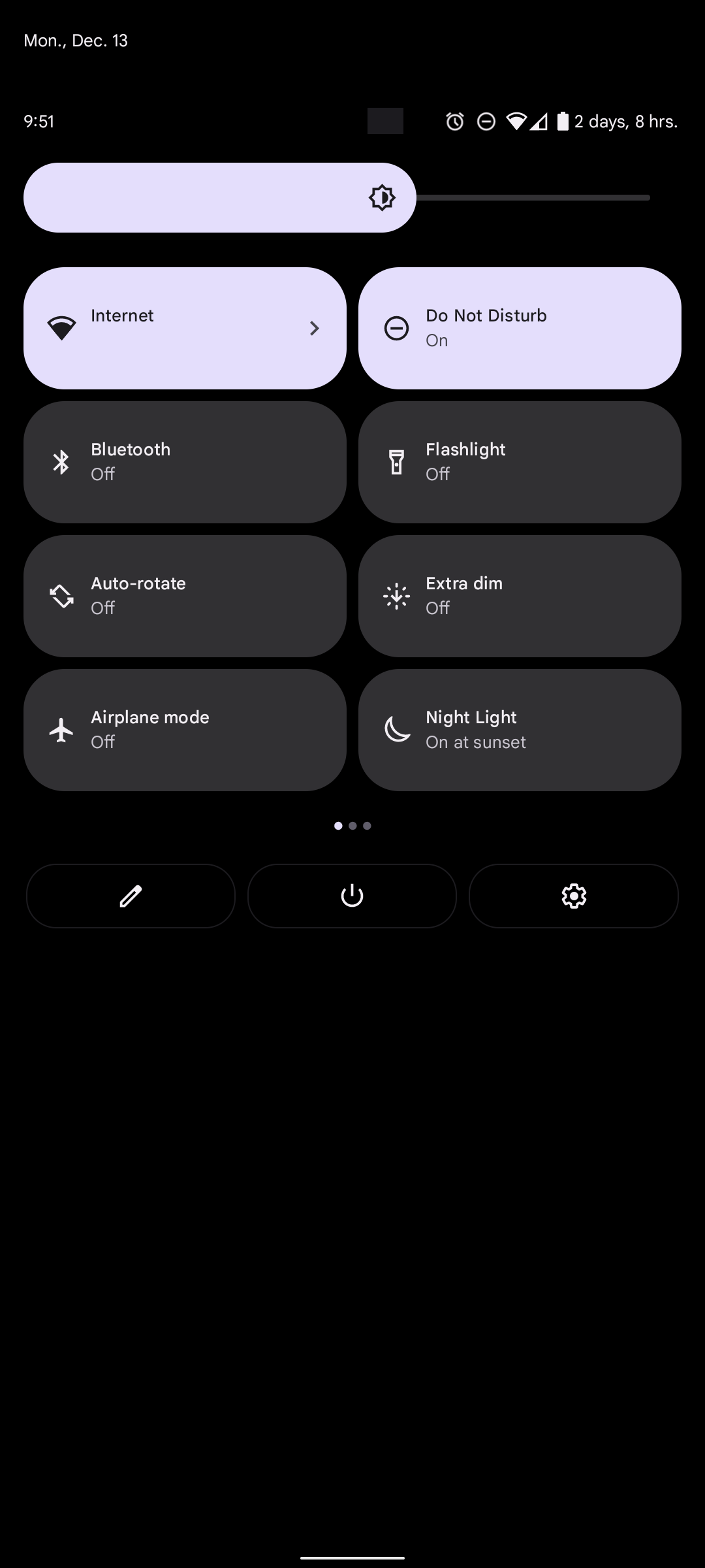
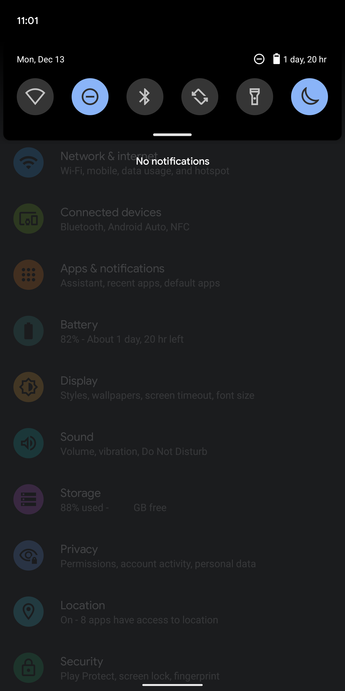
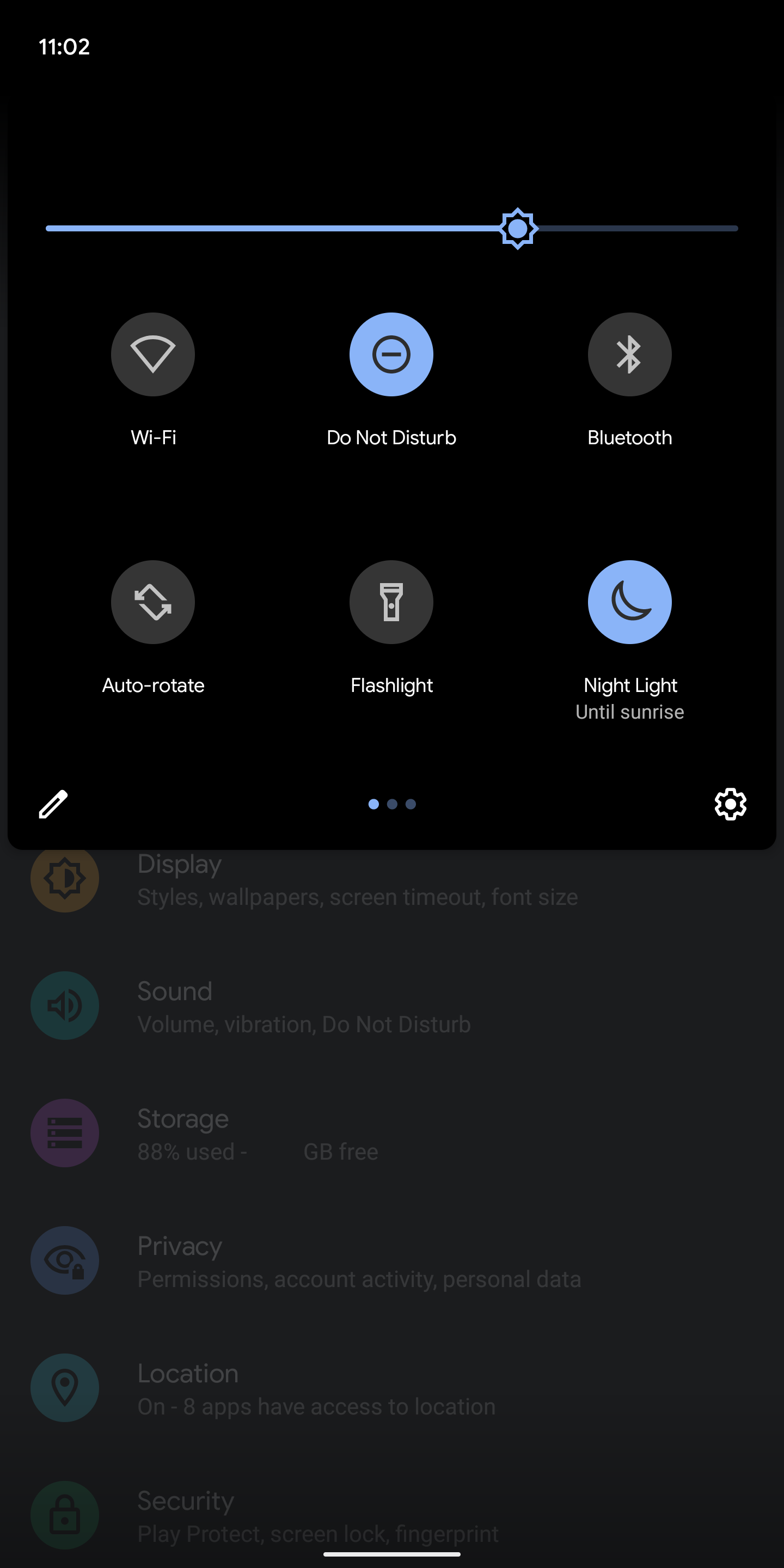
4 Tile Buttons from the top menu
You only get 4 Tile Buttons from the top menu when you drag it down. But drag it down again and you get 8. In Android 11 you could see 6 Buttons. This continues the theme of less is more?
The Good
Wikipedia has a list of all the new features, it’s a pretty short page though.
Battery life so far has been good on a Pixel 6, so I suppose this means Android 12 has something to do with that. Also, the green indicator when the microphone or camera is active is nice to see.
Comparing Android 11 to Android 12
This is what Android 11 looks like. No useless empty space around anything! And the Dark Theme is actually dark, brilliant!
Android 12 Conclusion
Android 12 is based on Android 11. So maybe just stick with that, if you can. Android is still great overall!
Also my references might not be exact, since my experience is from two different phones. Android 11 is on a Pixel 2XL, while Android 12 is on a Pixel 6.